CINCINNATI – FC Cincinnati came to life on Monday night – the Major League Soccer version of FC Cincinnati that is. The club’s long-awaited and much-speculated MLS identity was unveiled before a capacity crowd at the Woodward Theater and via a worldwide live stream.
In an ode to what the club built in its first three years of play, the new MLS look takes the club’s vision and identity into the future.
The branding system was created in tandem with Interbrand after an intensive three-month process that culminated in early August when it was presented to Major League Soccer officials at the 2018 All-Star Game.
The Name
FC Cincinnati, a name that immediately resonated with the region and took hold both nationally and internationally, remains. However, the words from which “FC” is shortened have changed.
“Football Club Cincinnati” – the team’s full written name – will take the field in MLS. The name is to be shortened to FC Cincinnati on first reference. “FCC” is acceptable on second reference, as is “FC Cincy” if necessary. “FC” is not an acceptable reference at any time.
NOTE: The much-speculated name Fussball Club Cincinnati – or Fußball Club Cincinnati using the German character – is the formal, legal name of the club and its business units. It is not to be used in any sporting references to the team, or in any public discussion.
The Colors
FC Cincinnati’s familiar “Orange and Blue” color scheme remains as the club moves to MLS, but now they’re brighter and bolder.
The club’s new Orange (PMS 021) and Blue (PMS 287) pop more, with the secondary colors of Dark Blue (PMS 282), White and Grey (PMS Cool Grey 4c) added to help amplify what is a unique color palette in soccer.
The Logos
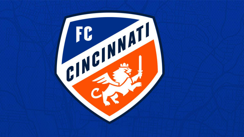
The new FC Cincinnati crest was developed as a representative of the city. Inspired by Cincinnati – itself a city on the rise – the crest highlights the region’s German heritage in a modern manner.
The winged lion has been carried over and has taken a more prominent place on the shield. It is bolder, stronger and ready for battle. It represents the club’s winning spirit, while its crown pays homage to the Queen City.
The seven points on the lion’s mane represent the seven hills of Cincinnati, while the wings’ three feathers highlight the club’s three-year journey to MLS. Curved into a “C”, the lion’s tail is another nod to Cincinnati.
Featuring the club’s two new primary colors, the crest also introduces the accent dark blue and it helps provide emphasis against the white background to further emphasize the word “Cincinnati.”
The team’s new wordmark is a familiar update on the team’s original mark. Still an orange and blue combination on FC Cincinnati, the crown remains firmly affixed atop the “C” in Cincinnati – again, a nod to the Queen City. Written straight out with no breaks or punctuation between letters, the FC moves straight into Cincinnati to show the club’s direct connection to the city.
The club’s new secondary mark is the stylized FCC from the full wordmark, while stand-alone tertiary elements will eventually include the full lion from the crest, the lion’s head and mane, and the crown. Those elements will be introduced more prominently in future years as the brand gains traction in the marketplace.
The Taglines & Hashtags
FC Cincinnati has introduced two new taglines to represent the club’s ambitions and goals, and has cemented a long-standing term as an official team reference:
- Ignite and Unite
- Now and Forever
- The Orange and Blue
“Ignite and Unite” reflects the passion and energy of our club to inspire people to connect and join together. As witnessed in the club’s first three years, FC Cincinnati’s fan base is magically diverse and has connected different communities – demographic, socioeconomic, geographic, ethnic, etc. The club has become a rallying call for people to forget their differences and come together to support a singular subject as one.
“Now and Forever” not only captures how FC Cincinnati has arrived here at MLS, but it also conveys how the club will continue to strive for more and aims to continue its momentum in galvanizing the region behind a common source.
“The Orange and Blue” has been used by the club for much of its early history, but now the nickname is solidified in the brand as FC Cincinnati moves to MLS. It is an acceptable second reference to the club and the team, as well.
In terms of official club hashtags, #IgniteUnite will now be integrated as an official club hashtag, in addition to #FCCincy, which the club has used since its inception.
When using emojis to represent “The Orange and Blue,” the orange and blue diamonds – either the small or large versions – are acceptable with the orange emoji first, followed by an ampersand and then the blue emoji. (Examples: 🔶&🔷, 🔸&🔹).
Club Values
The new MLS identity was built on the foundation the club laid in its first three years in the country’s second division, and honed to reflect the club’s vision for the future.
The MLS brand will help FC Cincinnati write a new chapter in its story and is focused on four core values:
- Inclusivity
- Openness
- Commitment
- Passion
The club’s values are evident from the field, up through the stands and into the club’s business initiatives. FC Cincinnati is a safe haven for all, no matter a person’s background, resources or identity.
We are open and honest to our fans and our community, transparent in all we do – whether it’s the easy road to take or not. We will not shy away from hard topics, but rather embrace the opportunity to educate and establish who we are.
We are committed – not only to winning – but to providing the best experience and relationship to our fans and supporters. Our desire to better our community, both at micro and macro levels, is evident. As we begin construction on our new MLS stadium in Cincinnati’s West End neighborhood, we’re dedicated to using our influence and resources to build and enhance the community in that neighborhood, as well as the Greater Cincinnati region as a whole.
Finally, passion should be evident in all we do. Whether it’s on the field, in the stands or in our day-to-day business in the community and with partners, a fervor for FC Cincinnati should be reflected at all times. There is no better representative for our club and its culture than a positive and energetic experience in anything in which the club is involved.
The Club Story
The new FC Cincinnati brand identity was forged from the club’s three-year trek and its desired path into the future. Part of that was articulating the club’s nascent history and the legacy it wants to set in the city and region.
Out of that came the detailed Club Story below, which will immediately bring readers inside the FC Cincinnati experience and offers dramatic homage to the club’s rise and what it stands for as it moves forward:
There was a rumble. Then a rising. Now a resounding roar. From the streets to the stands, there’s an unstoppable, undeniable energy that is FC Cincinnati.
Rooted in the Queen City’s rich heritage, and built with the hearts and hands of our own community, we are united through the joy of our sport.
Relentless in our pursuit. Fearless in our vision. We’re in this – together.
Crossing bridges, banding neighborhoods, first-timers to seasons die-hards – here, everyone is welcome.
The passion is palpable. The camaraderie contagious. And the pride unrivaled.
Echoing through the seven hills of our city, we’ll continue our commitment to carve our own path to elevate Cincinnati, and to keep rising.
What They’re Saying
Carl H. Lindner III, FC Cincinnati Managing Owner and CEO: “We’re thrilled to introduce our MLS brand. FCC has forged a strong connection with our city over the past three years. As we move into the future as an MLS club, our new look maintains that strong connection and reflects our passion and ambition for world-class soccer in Cincinnati.”
Jeff Berding, FC Cincinnati President and General Manager: “Developing our MLS identity has been an intensive, yet gratifying process, that has been so well-worth the end result we’re presenting today. We’re incredibly proud of the development process and what we present today as our final product. We firmly believe these new marks and brand system are a perfect representation of our club as we enter Major League Soccer. We introduced local, organic elements to refresh our look, yet kept specific iconography from our early years to retain familiarity. We cannot wait to take the field in 2019 bearing the FC Cincinnati – Football Club Cincinnati – crest on our chests.”
John Cranley, Mayor of Cincinnati: “We are thrilled to see FC Cincinnati make the move to Major League Soccer. The club has clearly had an immediate impact on our city and has very quickly become a key thread in our region’s fabric. The club took such care and thought to integrate so much Cincinnati symbolism into its MLS logo, that we know our city will be proud to wear it. And not only here at home, but also when they travel around the country and the world, bearing the name Cincinnati on their hearts. All of Cincinnati is looking forward to 2019 as FC Cincinnati debuts in MLS with this beautiful crest leading the way.”
Brian Erdman, Managing Director of Interbrand: “We could not be prouder of the collective effort and output from this rebranding that elevates our local club to the MLS stage, and ultimately to the world stage. Through a collaborative, co-creation process that brought together fans, the community and key stakeholders, we’ve evolved the brand identity in a manner that respects the club’s existing equities and past, reflects the local community and heritage, and asserts FC Cincinnati as a powerful force to be reckoned with in MLS.”
Interbrand’s Work
Interbrand’s scope of work on FC Cincinnati’s MLS brand development included articulating FC Cincinnati’s brand story and experience principles, as well as ideating and developing the club’s updated logo and visual brand identity system. Interbrand relied heavily on fan-based research to inform and inspire the new identity.
Interbrand is a leading global branding agency that provides both world and local perspectives to its clients’ projects. Interbrand’s Cincinnati office – which includes a Cincinnati born-and-bred team that led the FC Cincinnati brand update – is backed by the agency’s 21 global offices and brings a unique perspective to the project.
The FC Cincinnati MLS brand project is one of many sports-related properties Interbrand has launched recently, including the progressive update of Italian Serie A power Juventus’ brand, as well as the PyeongChang 2018 Winter Olympics and the Sochi 2014 Winter Olympics.
FC Cincinnati, Interbrand and Major League Soccer began strategizing the FCC brand refresh soon after Cincinnati was invited to join MLS in late May. The accelerated project evolved rapidly and was completed in early August when FCC presented the updated brand to MLS officials at the 2018 MLS All-Star Game in Atlanta.
The next time FC Cincinnati takes the field, it will be as an expansion team in Major League Soccer. FCC will begin as the league’s 24th team in 2019. Season tickets for the 2019 season are now on sale at fccincinnati.com/tickets. For up-to-the-minute information about FC Cincinnati, visit the team’s official website at fccincinnati.com, or follow the team on Twitter, Instagram and Facebook at @FCCincinnati. For more information about FC Cincinnati tickets - including 2019 season tickets - call 513-977-KICK (5425) or visit fccincinnati.com/tickets.


